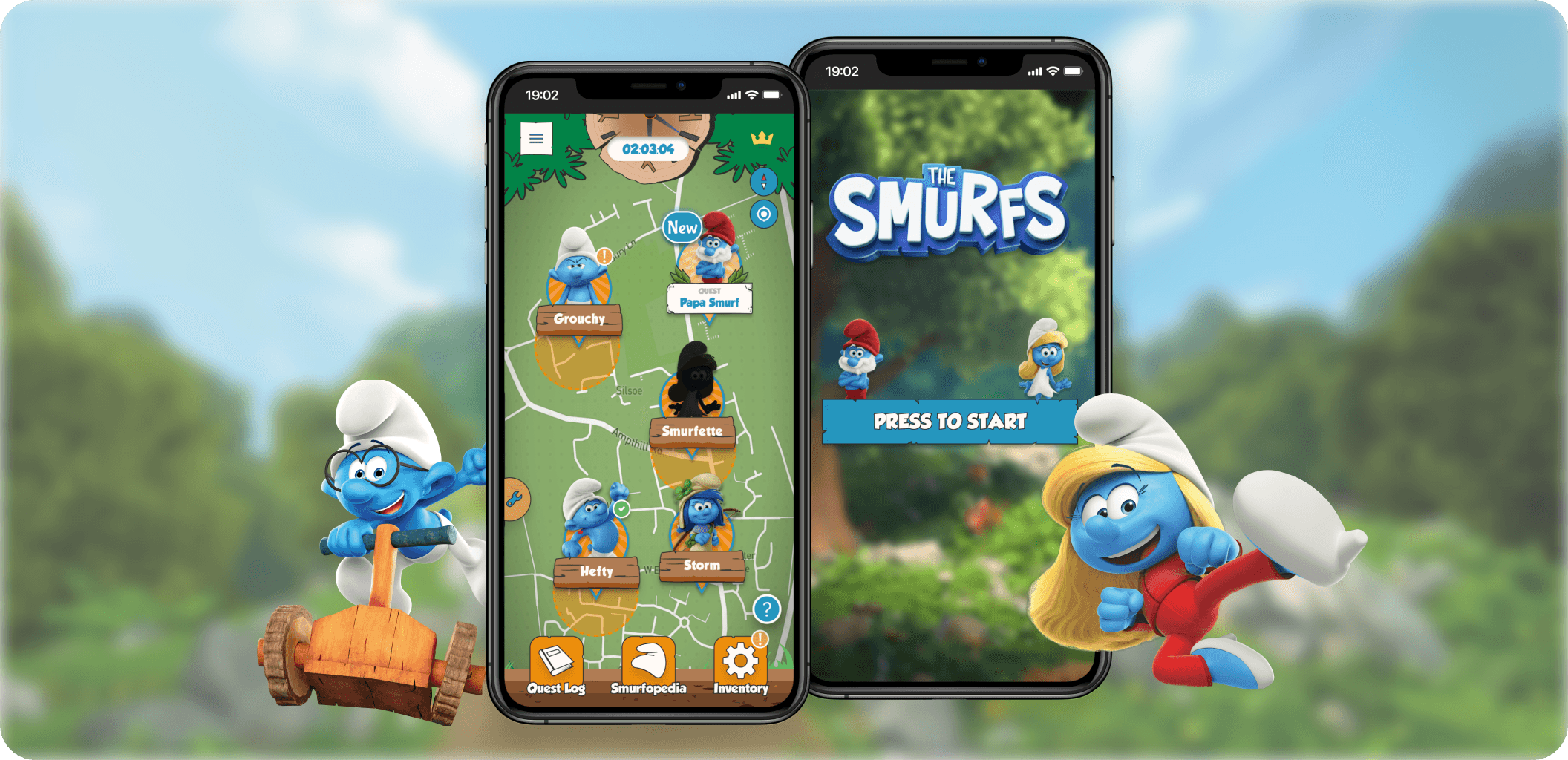
The Smurfs
Designing an Immersive Geo-Location Mobile Game
Date
6 Feb 2022
Client Name
Studio Peyo
Services
Mobile App Design
Design Systems
Expanding a Beloved Brand Through Gaming
This project was a cross-studio collaboration to bring the Smurfs into a geo-location mobile game. While the partner studio handled the IP, our team focused on building the gameplay systems and user experience.
My Role
Led UX for mobile features and core game systems
Aligned design direction across both studios
Ran player testing and translated feedback into design improvements
Delivered wireframes, prototypes, and clear documentation for development
Setting A Clear Goal
Collaborating with an external studio meant aligning on creative direction and business strategy. Our goal was to explore a licensing opportunity that expanded the Smurfs brand into location-based gaming.


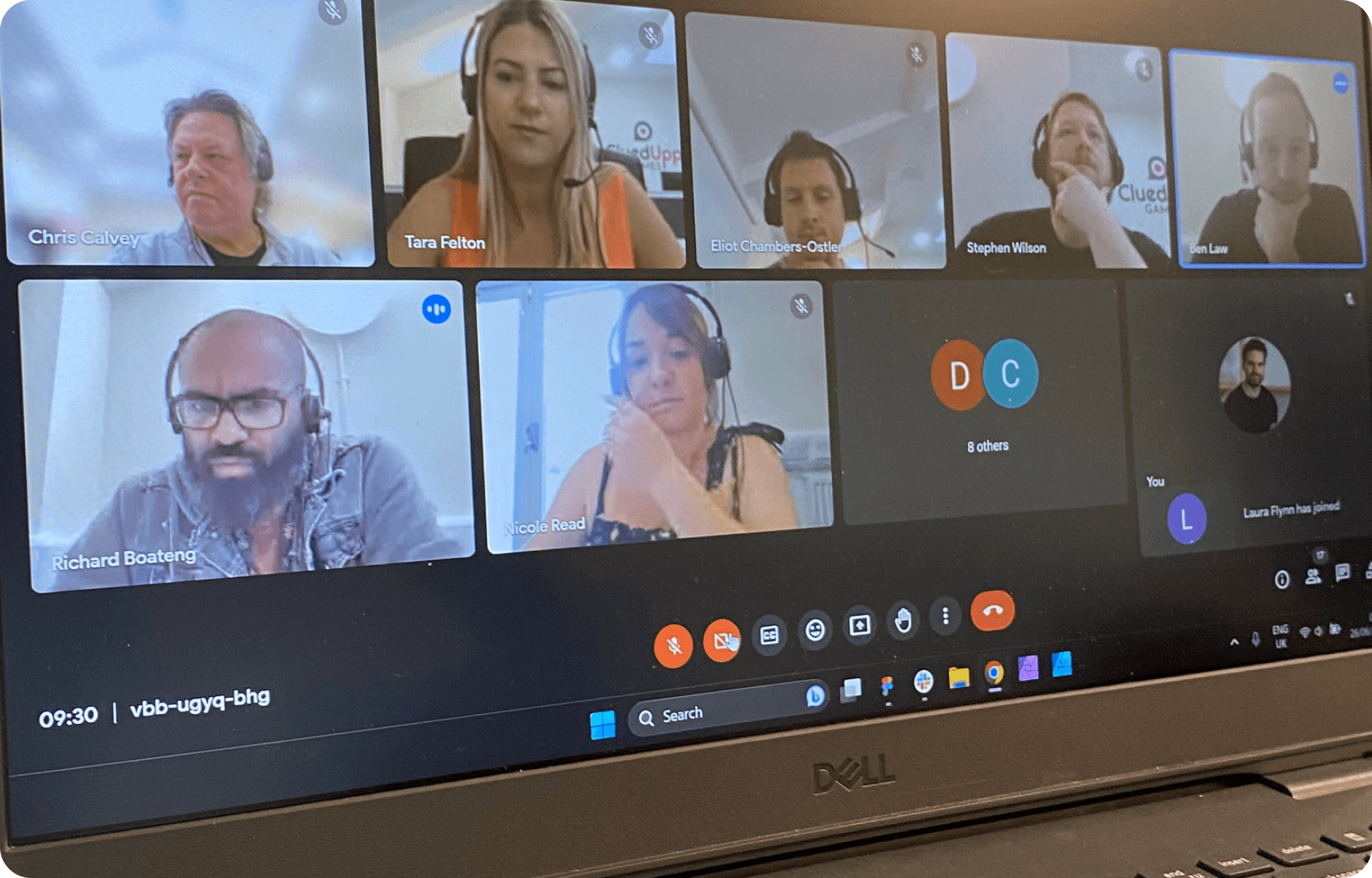
Understanding Users and Business Constraints
I joined stakeholder workshops and user research to align player needs with branding goals. Players wanted easy onboarding, clear motivation to walk, and a sense of progress. The IP owners prioritised brand clarity and all-ages accessibility.
To bridge both, I mapped key user journeys from onboarding to crafting and identified friction points to guide design priorities.
Data Driven Design
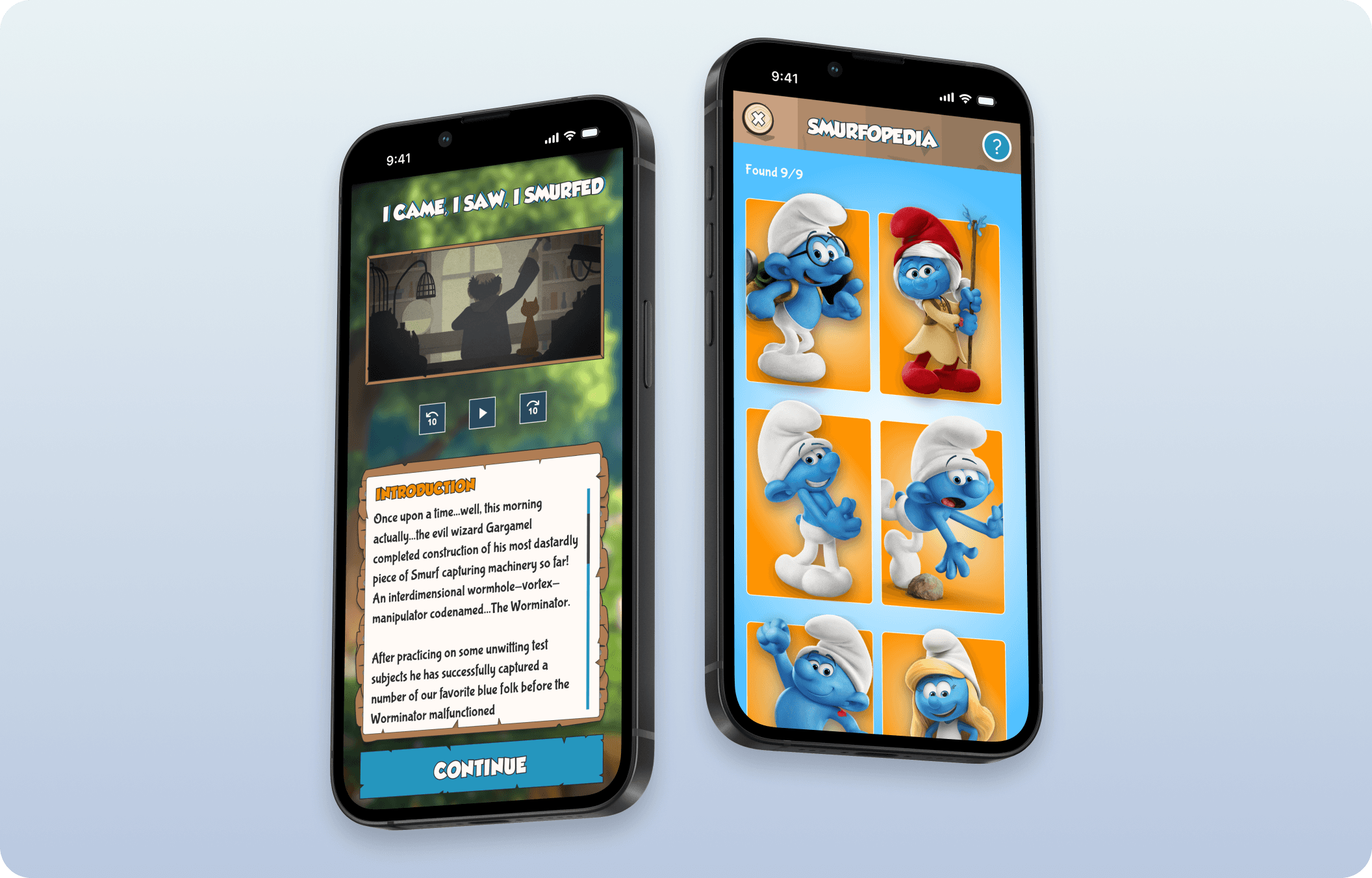
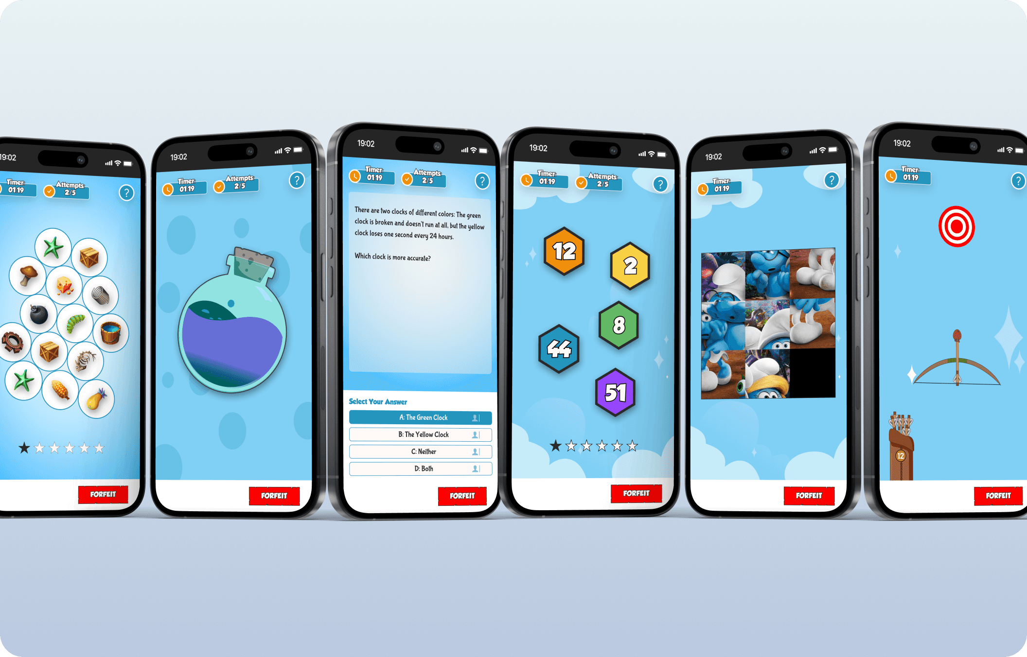
Live player data revealed confusion around crafting, inventory, and how movement influenced gameplay. I collaborated with developers and producers to simplify these systems and reduce decision fatigue.
I also restructured interfaces, clarifying button hierarchies and minimising nested actions to better fit mobile usage patterns.
Fine-Tuning Game Mechanics Through Player Feedback
I continuously reviewed feedback from Discord, support tickets, and QA to identify pain points. A key issue was disconnected systems, like item collection not clearly linking to progression. I worked with developers to tighten these loops and make the UI more purposeful.
Small wins with big impact:
Tweaked UI timing for better feedback
Added helpful text and icons in confusing spots
Removed extra taps and visual clutter in core flows
Outcome
The final experience was clearer, more engaging, and better suited to casual mobile players. We reduced friction, improved usability, and stayed true to the brand, resulting in a smoother, more polished product that we shipped with confidence.
What’s next?

Outsourced Events
Marketing & Events